Advertising
Past clients include pharma heavyweights, biotech giants, and global non-profits using their power for good.
I've had the pleasure of working with and managing talented copywriters and designers on print, web, and television campaigns in Chicago, New York, and San Francisco. In recent years, I do it solo and on the side, pitching creative for causes I believe in.
Publishing
Photo editing and design of science and economic texts and magazines.
GOALS PRETERM DELIVERY TOOL

Project: GOALS decision support tool: Reducing disparities in preterm birth and improving maternal and neonatal outcomes.
This tool is used by physicians and researchers at UCSF and Indiana University School of Medicine who collaborated on an educational tool for women who showed signs of early delivery that posed risk to the health of the baby. The tool is designed to present statistically possible outcomes, and present the options of resuscitation versus palliative care.
My role: As the UI and information designer,
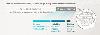
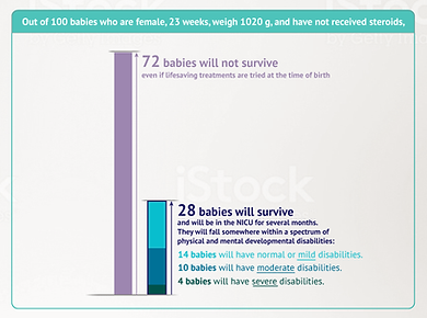
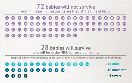
I designed both the user experience and infographics, in particular visualizing very sensitive information and presenting it in a way that is both educational and compassionate.
Design for data: The data represented potentially upsetting news, designed to help young mothers choose between resuscitating their newborn infants or allowing them to pass peacefully.
I needed to pair a harsh reality with a caring tone, and deliver what might be shocking news with empathy and kindness. Users input the information requested into an Outcomes calculator, which then delivered 1) an estimated percentage on the survivability of their unborn child, and 2) if they survived, the extent of their possible disabilities. The first step in the process was to organize the outcomes in these two sections in a way that would not feel overwhelming.


Visualizing and humanizing data: Each depiction of the data was tested with patients to ensure the points were clear and objective.
The study was not meant to persuade patients to choose either alternative, and we strove to keep the presentation of both options unbiased and brief as possible.


The winning execution depicted nonsurvival as pink and blue ribbons, the symbol for infant death. I designed icons representing survival as a onesie, a swaddled newborn, and an infant footprint.
The footprints (below, right) were preferred.
Result: The tool was positively received by the research team who continue to use it in clinical settings with women in pre-term labor.
We added a Personal Values page, meant to further help mothers with their decision by gauging their own priorities in making decisions involving their infants' wellness. Descriptions, including "Day in the Life" videos of children on different points of the disability spectrum were also included (provided by the client).

